The new LinkedIn company page design and how you can prepare

Table of contents
If you thought your marketing efforts on LinkedIn weren’t translating into meaningful results, then think again, because LinkedIn is bringing you a newly designed Company Page, which will hopefully generate much higher engagement and conversions than your old one.
In fact, some of the big players in the field—including GE and IBM—got a head start and are currently testing their new LinkedIn pages in beta before they’re rolled out to every other brand. But instead of seeing this as a disadvantage, see it as an opportunity to properly prepare for the changes and invigorate your strategy.
LinkedIn says that you can switch back and forth between the new and old admin experience until they release the new designs to all members. So in the meantime, let’s take a closer look at the changes you can expect and start preparing for:
Cleaner and more engaging design
As you can see, the new layout looks simpler and cleaner, emphasizing larger images and less text, making it easier to navigate. Since LinkedIn is a place for building connections, your cover image should also be updated or redesigned to fit the new measurements – 1536 by 768 pixels. The same goes for your company logo design, which should be at least 300 by 300 pixels.
Besides your visuals, you can say goodbye to clutter and hello to the three main content buckets: Overview, Jobs, and Life. Now members can smoothly transition from one category to another, getting to know your brand in a whole new way.
Overview
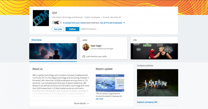
If you click on the ‘Overview’ tab, all of the information about your company – About us, Specialties, Industry, Company Size, etc. – has not changed and will automatically transfer from the old design to the new one. Users can still click on the arrow to read more or fewer details about your company, but remember to keep this short and sweet!
You may have noticed the new ‘Company Photos’ box on the right-hand side. This box lets you showcase images that give prospective customers and employees a quick insight into your company. It’s especially great if you’ve got a vibrant work culture you’re proud of!
In case you have multiple (or any) Showcase Pages, this new layout should be a real winner! Instead of being hidden on the side, the new interface highlights the rest of your business areas. From your prospects’ and clients’ perspective, this layout makes it easier to get to know your company better, and from your perspective, it helps you build stronger relationships with them.
Next, whether the new ‘Company Updates’ presentation is better or worse is debatable. Yes, users must be on the Overview tab and scroll down to view your posts. However, they are a lot more aesthetically pleasing AND readable. There is no longer a preview of text, so if you’re used to summarizing an article’s content into an engaging description, you no longer have to worry about it. The focus has shifted to bolder images and titles, and your job as a marketer is to ensure they complement each other to tell a coherent story.
Jobs
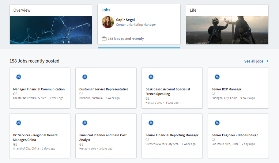
The new ‘Jobs’ tab makes it easier for you to promote open positions. At the same time, it makes it faster and easier for job seekers to navigate to and find the information they need while learning about multiple aspects of your business from a single interface. A win-win situation! Audiences can also view available positions directly from the top banner, without going to the ‘Jobs’ section.
Life
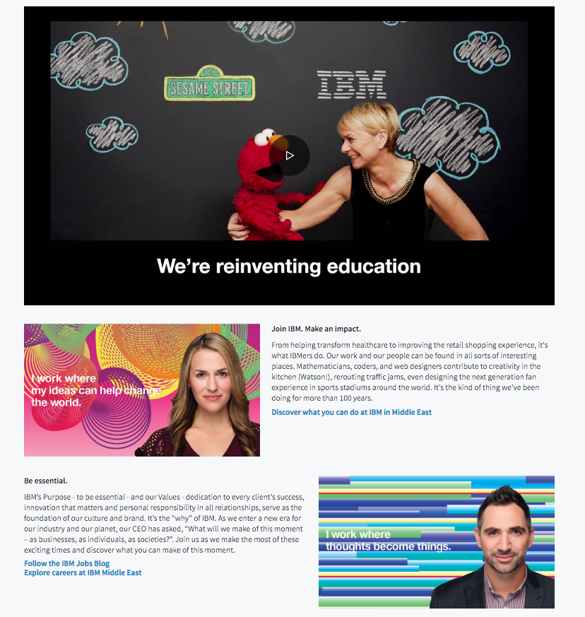
Building a career today means much more than finding stability, and individuals can quickly Google your brand’s name to discover its values, community, and culture. In this regard, LinkedIn’s unique feature is not only useful, but it’s also incredibly interesting!
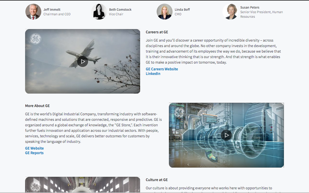
From your employees’ perspectives to cultural insights, and images of fun company activities and gatherings, all elements that make up your work culture can be aggregated into one place for transparency. This is a way for you to paint a positive and healthy picture of your organization’s biggest achievements and proudest employee advocates – and for this, you need content! As you can see, IBM and GE clearly invested a lot of time and effort in personalizing their ‘Life’ sections with detailed information about their expertise, values, culture, and more! They also combined branded videos and images, making the user experience much more valuable and engaging.
Easily manage your company page
Perhaps you have experienced frustration with managing your LinkedIn account. Well, on the new company page, there is a dedicated admin experience that makes it easier to edit content, publish and follow posts, and monitor analytics and notifications—all in one place!
LinkedIn also highlights another benefit of the modified version: an expanded analytics dashboard. This helps you measure the impact of your content and optimize its performance. However, if you’re a B2B marketer, LinkedIn’s vanity metrics, such as reach, likes, and followers, only paint a partial picture of how LinkedIn impacts your sales funnel. At the end of the day, businesses need to see real results – and measurable ones. By implementing a data-centric social media management platform that caters to B2B marketing, you’ll gain a deeper insight into the engagement and leads generated through LinkedIn and be able to understand exactly which content pieces are driving those results.
