Video Thumbnails: 3 Easy Tips to Getting the Click

Table of contents
Though discouraged by a popular saying, judging a book by its cover is a major element of being human. Whether it be an actual book, a movie trailer, or even a person, our first inclination is to form a judgement based on the images presented. The same holds true for video thumbnails.

Video Thumbnails, or compressed preview images, can be thought of as windows that allow prospective viewers to get a quick snapshot of your video.
These small images, therefore, play a big role. They must convey the subject matter, tone, and style of your video… all within a few milliseconds.
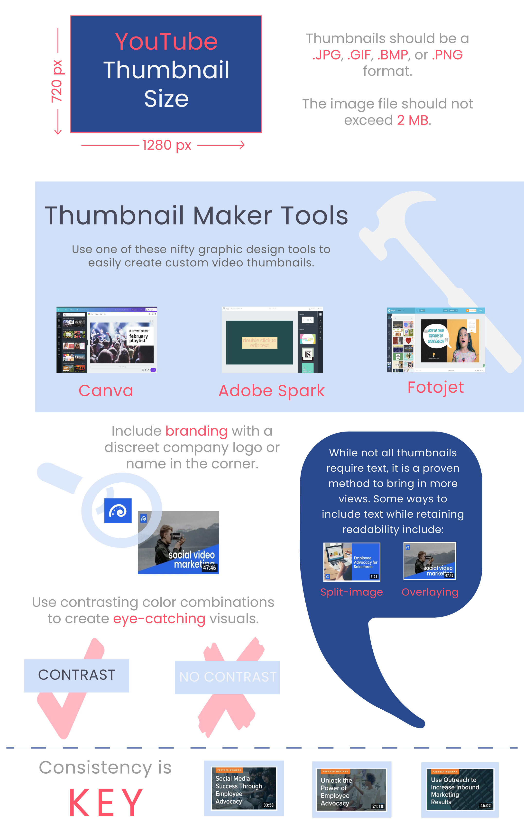
Creating the perfect image might sound like a daunting task, but with these three simple tips in mind you will be on your way to creating eye catching thumbnails that will encourage viewers to click your play button.
Let’s take a look at these YouTube thumbnails from a simple, and perhaps familiar, search – how to train my dog.
1. Use few, and relevant, subjects.
Notice how each thumbnail only includes the two main characters involved in dog training – the dog and the human who is training the dog. There are not a lot of other animals and humans because the act of training a dog is often a one-on-one experience. This may seem self-explanatory, but the inclusion of too many or unnecessary subjects is one of the most common video thumbnail mistakes.
To avoid this, think about the content of your video, and then decide how you can portray it with as few subjects (people or objects) as possible. Though few in number, however, they should still take up a large portion of the frame. A good target ratio is 50 percent image and 50 percent background or text (more on that later).
2. Show the action(s) within the video.
As mentioned earlier, thumbnails are a peek into the video. The dog-training thumbnails all show the humans and the dog interacting with each other, which is exactly what you will expect to see throughout the video.
Apply this same principle when creating your thumbnail image. Convey the overarching nature of your video by capturing an action that aligns with what the viewer is looking for.
One way to gauge your video thumbnail is to imagine that it stood completely alone from the title of the video. Would you still be able to grasp the overall content matter? This is important because the very short time of deciding whether or not to click will be mostly allotted to the thumbnail, not the title.
Unless it is a tutorial on how to pose, you should almost never include poses in the video thumbnail. Avoid these yawn-generating images by instead showing a person/people doing an action in which they are not directly looking and smiling into the camera. This will make your video seem more relatable and inviting.
Recommended for further reading
3. Include words to give context.
Including text within the video thumbnail is a good way to convey more about your video than you could with an image alone. This is not, however, a chance to add the entire video synopsis.
Like the dog-training thumbnails with text, it is best to keep it short and sweet – no more than five to six words. If you are unable to read the thumbnail while scrolling down the page, it is most likely too long.
When deciding which keywords to include, think about which words your viewers would gravitate towards. For example, for video tutorials consider using phrases such as easy, quick, or start here.
Find out more about text, images, and video thumbnail maker tools below.


